We should have seen this one coming! Pantone has named its Colour of the Year as: Rose Quartz (13-1520) and Serenity (15-3919).
Joined together, Rose Quartz and Serenity demonstrate an inherent balance between a warmer embracing rose tone and the cooler tranquil blue, reflecting connection and wellness as well as a soothing sense of order and peace. Read the full Pantone Colour of the Year 2016 press release.
 |
 |
 |
 |
The blending of these two colours may be a first for Pantone but our artists have been creating beautful pieces of artwork in chic, contemporary, pastel hues throughout 2015.

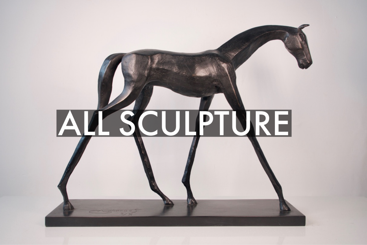
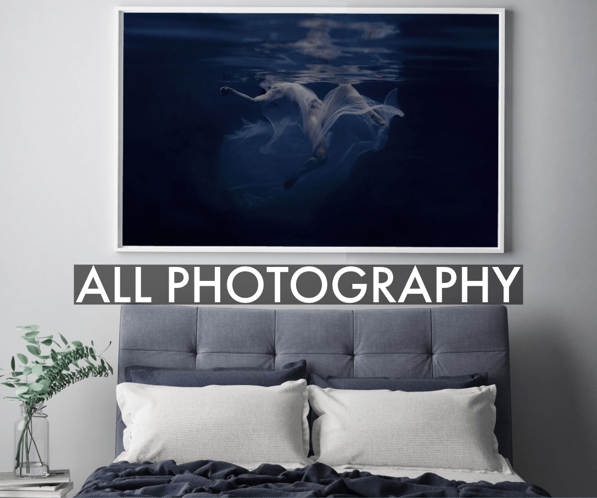
We have curated a selection of Pantone Colour of the Year inspired artworks for you.
 |
 |
As consumers seek mindfulness and well-being as an antidote to modern day stresses, welcoming colors that psychologically fulfill our yearning for reassurance and security are becoming more prominent.


